Mixtape l Playlist Cover Design
This project began with three Spotify playlists, each reflecting a different aspect of my life and
personal journey. The challenge was to design a cover for each playlist using formal, methodological,
and conceptual constraints generated by Mitch Goldstein’s Obstruction Picker. These constraints
encouraged experimentation and unexpected approaches to visual storytelling.
Mixtape 01: New Journey
This playlist captures the memories of beginning a new chapter in the United States through songs
I listened to during my early years in the country, often while driving.
Obstructions:
Formal: Only triangles
Methodological: Use your transportation
Conceptual: Make it fake
I used my car to create a triangular pattern, connecting the design process to the place where I
often experienced these songs. The triangles also reference the familiar play button, linking the
composition to music. Red, white, and blue draw on the American flag, reflecting the playlist’s
American songs and the beginning of my life in the United States.


Mixtape 02: Time Flies
This playlist brings together songs that accompanied my growing sense of belonging in the
United States—songs I have continued to revisit over the years.
Obstructions:
Formal: Use numbers
Methodological: Do it accidentally
Conceptual: Make it false
As I became more settled, I developed a deeper connection to both the music and the country.
This period felt like a golden chapter in my life, even as time seemed to pass increasingly quickly.
The cover uses the songs’ release years to express the passage of time while responding to the
numerical constraint. Golden yellow represents the warmth and significance of these memories.



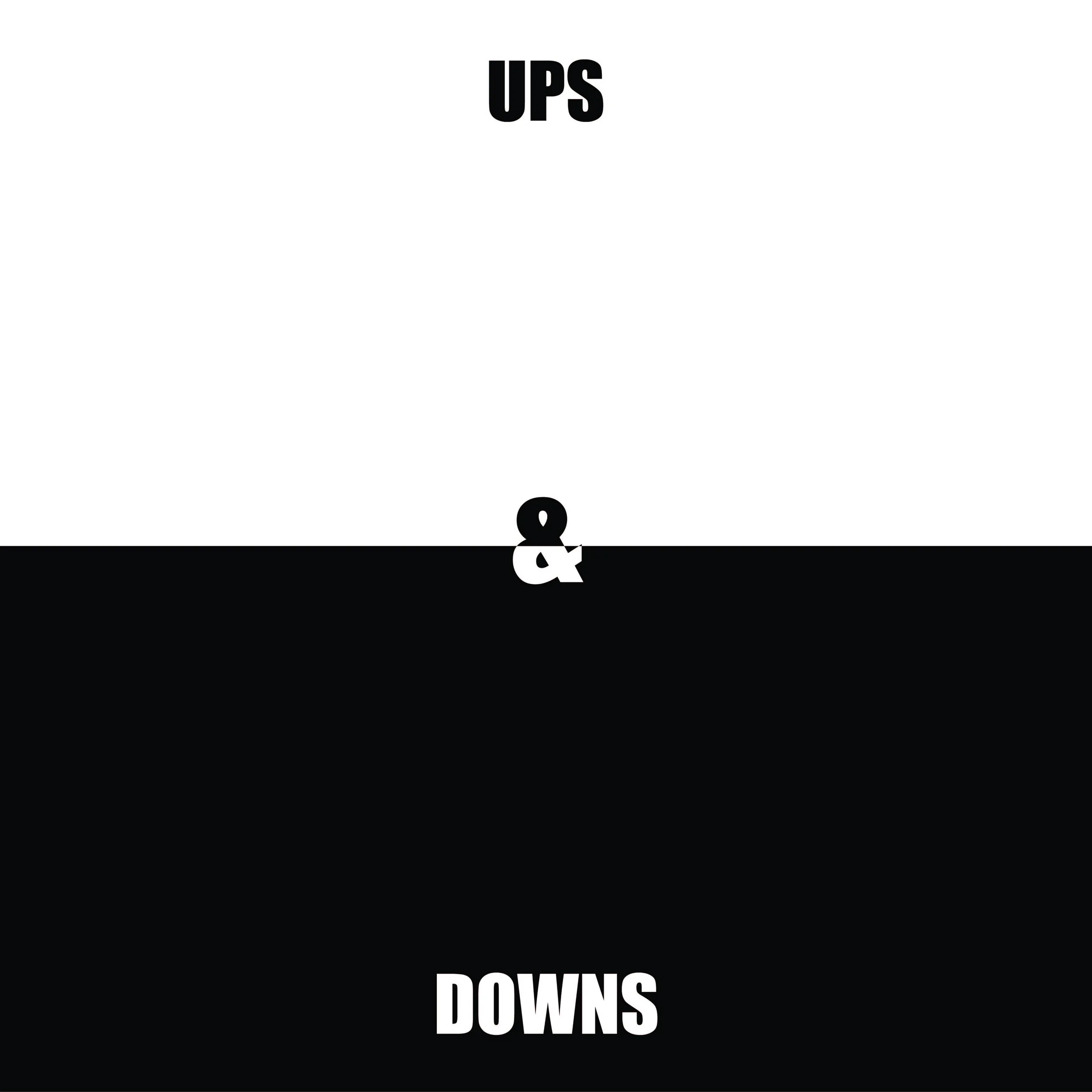
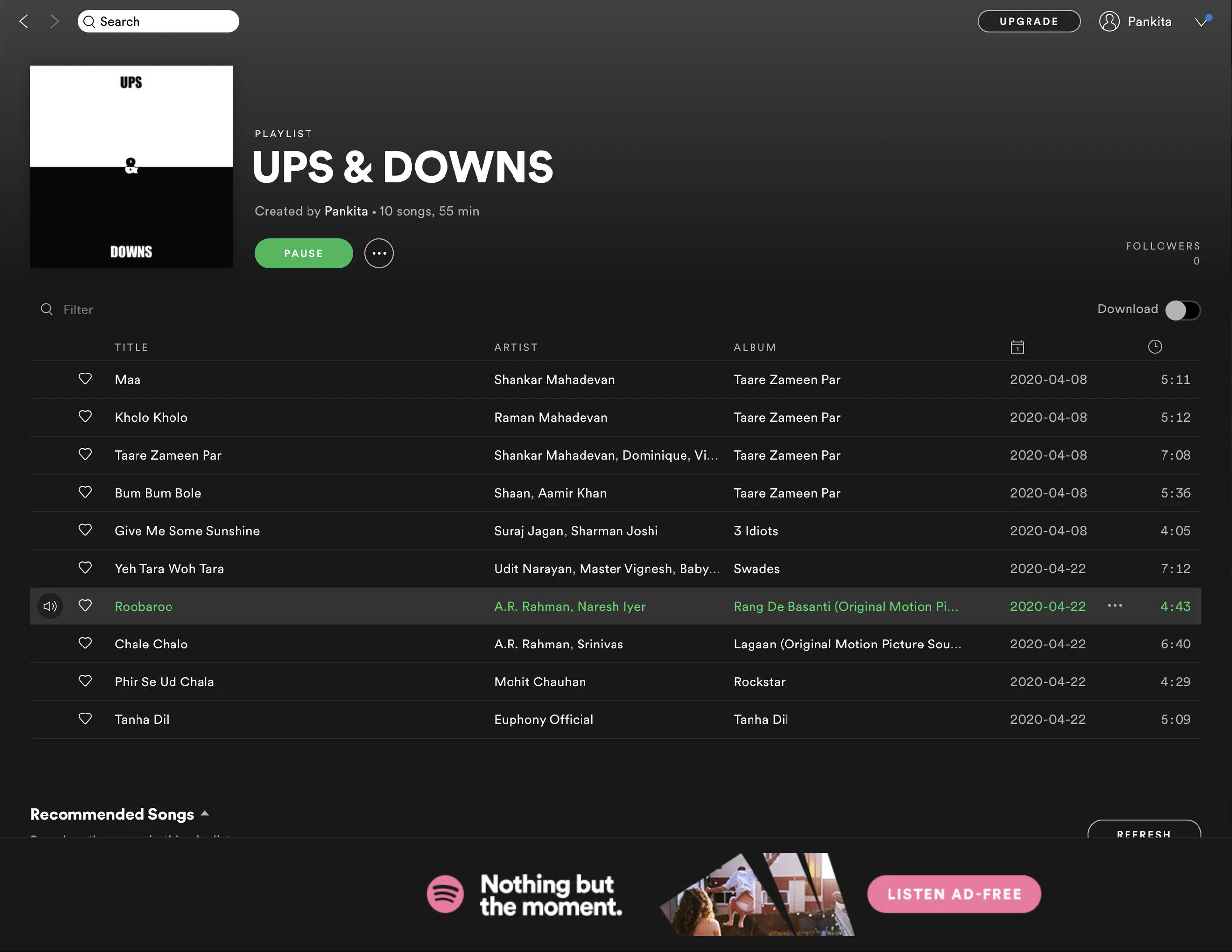
Mixtape 03: Ups & Downs
This playlist reflects the challenges and triumphs of my life. Its songs offer encouragement, affirm
individuality, and tell stories of struggle that resonate with my own experiences.
Obstructions:
Formal: 100% black + 100% white
Methodological: Do not use your brain
Conceptual: Make it smart
The black-and-white palette represents the darker and brighter periods of my life. Responding
intuitively to the methodological constraint, I placed black and white next to each other—the first
image that came to mind. This simple contrast expresses life’s opposing experiences and the
resilience that connects them.